Last night at ink

Today was the last night at my inking course.

I didn’t really get into the swing of things, but came out with this flowing water study. No references were used here. The teacher gives you a few ideas and let’s you make the mistakes for yourself. I’m especially not very fond of the smokestacks in the background.

DSC03614

June 7th, a Sunday drawing

Spent the morning just drawing what I could see from the couch.

20150607-1Then in the afternoon a few sketches at the Italian restaurant, in my scrap book with a crappy roller-ball-pen. Also used a bit of spit for the rose, just rubbing over with my finger to smudge the ink. Perhaps I should have tried the Aperol Spritz for that.

20150607-4 20150607-5

20150607-6 20150607-7

In the evening, another 30+ minutes with 1 minute gesture drawings. Nothing to show really, but the daily exercise helps in the long term. 1 minute gestures can begin to get really stressy if I attempt drawing bigger sketches than just thumbnails.

20150607-2 20150607-3

Plein air drawing

Well, here’s what comes from sitting on a bench for 1 1/2 hours while joggers pant past me every 10 minutes. One jogger even stopped to sit by me. It turned out he was my figure drawing class instructor asking when he’d be seeing me again at classes.

DSC03609

When sitting down for this (A4, 100gr, 2B pencil), I just sketched most of the objects first and then began work from left to right (I can’t keep my hand from smudging the sketch otherwise). Always returning to the left to darken parts which looked pale after using much darker tones to the right. I must admit, I thought I had taken on too much here, it took 90 minutes and I’m glad I only sketched the tree branches in the foreground. My main focus was actually the tree line on the border to the background.

Poppies, daisies and corn-flowers to my feet and bumble bees flying around like crazy.

How did it come to this?

I’d picked up the book “Pen and Pencil Drawing Techniques” by Harry Borgman and had spent a day with it, doing some of the early exercises a few weeks back.

DSC03605 DSC03607

I would normally have just built up monotone tonal values, but Mr. Borgman has already introduced me to tonal values built up with different stroke techniques.

Also, I now have a German urban sketching journal “Ein Jahr Urban Sketching” by Jens Hübner. And he recommended a book called “Watercolour Tips” by Ian King. I’ve been trying a bit of watercolour out the last couple of days and here is my first miniature “Norwich School” painting I did just before leaving the house for the “plein air drawing” sketch above.

DSC03608

First Attempts at Waterscapes

Again, … back from a Tuesday evening class, where our teacher gave us a 45 minute introduction to how he paints a very specific landscape, which we could use as a reference, or just do what we liked.

So, of course, I went for the do-as-you-like option. And here we are.

(This is all on really flimsy, calligraphy paper, my wife is going to kill me if she reads this. Using up all her paper …)

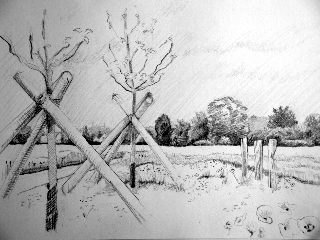
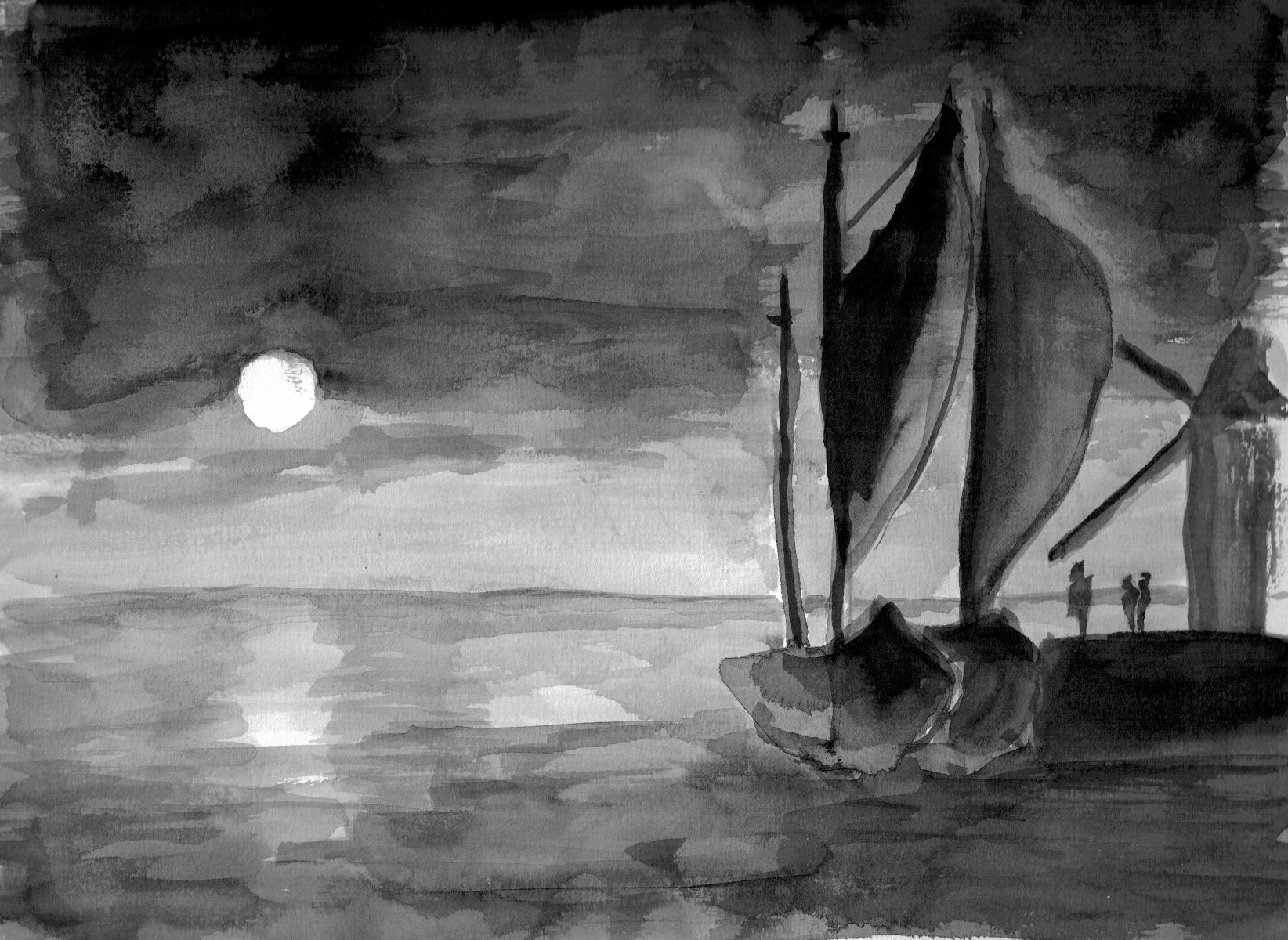
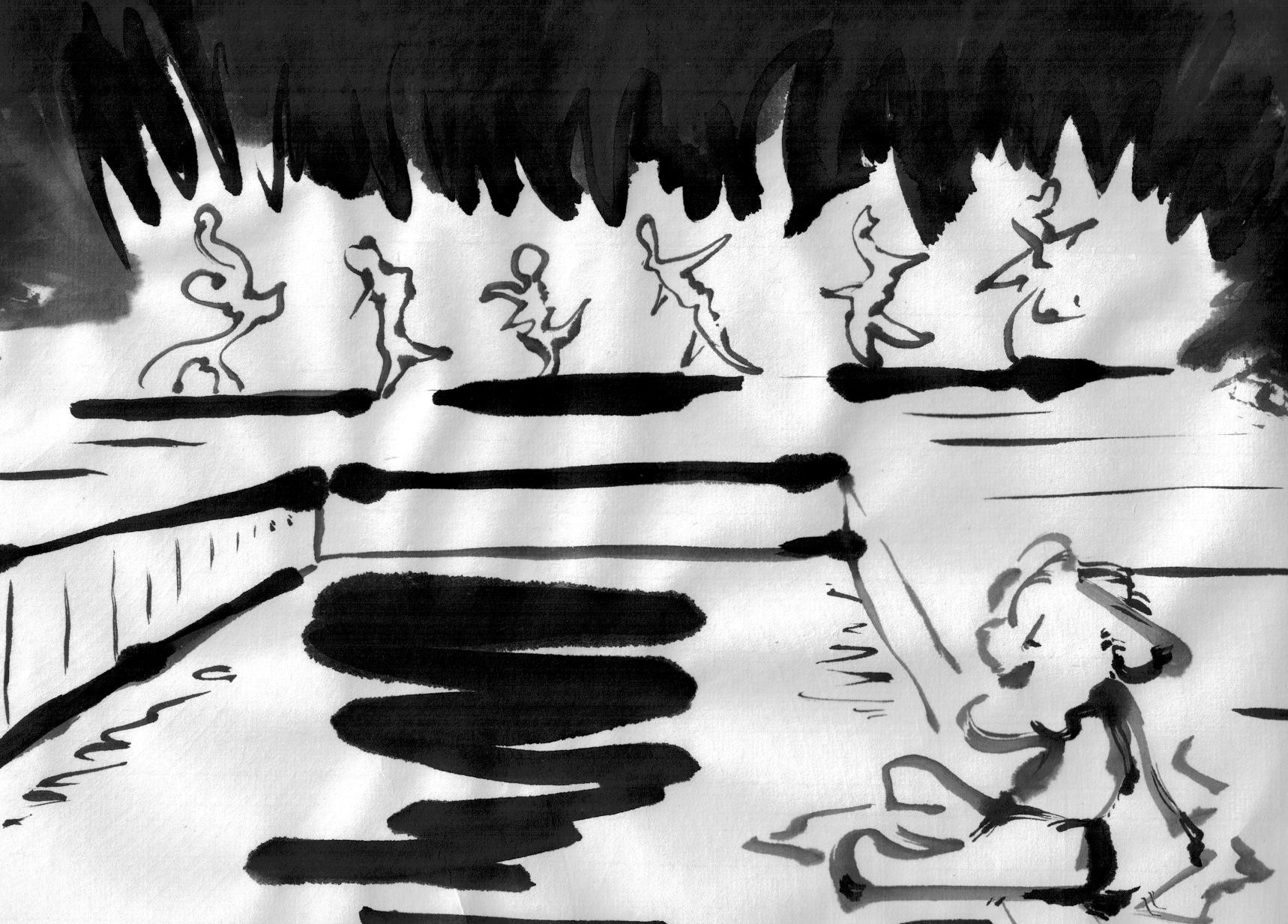
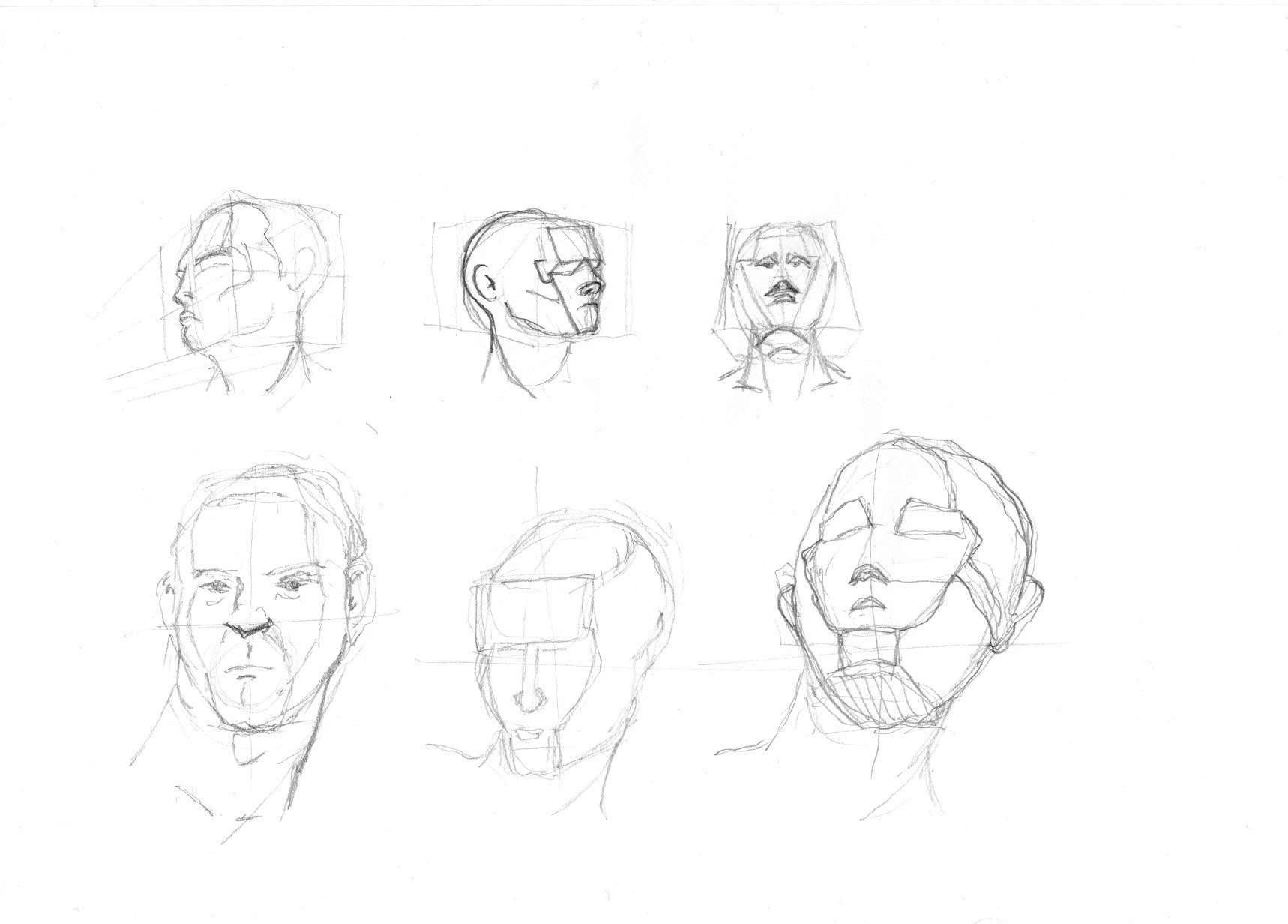
1st pic [CLICK FOR LARGER IMAGES], got some input during the course and adapted it here and there (got some pretty good advice, it’s this stuff you really need to memorize, so you can be objective about your pics during the making):

20150512-1

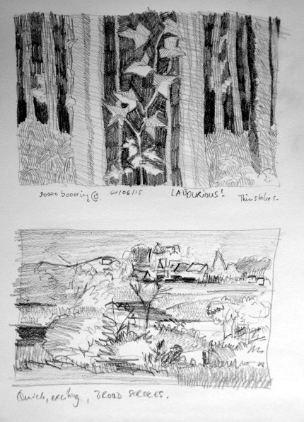
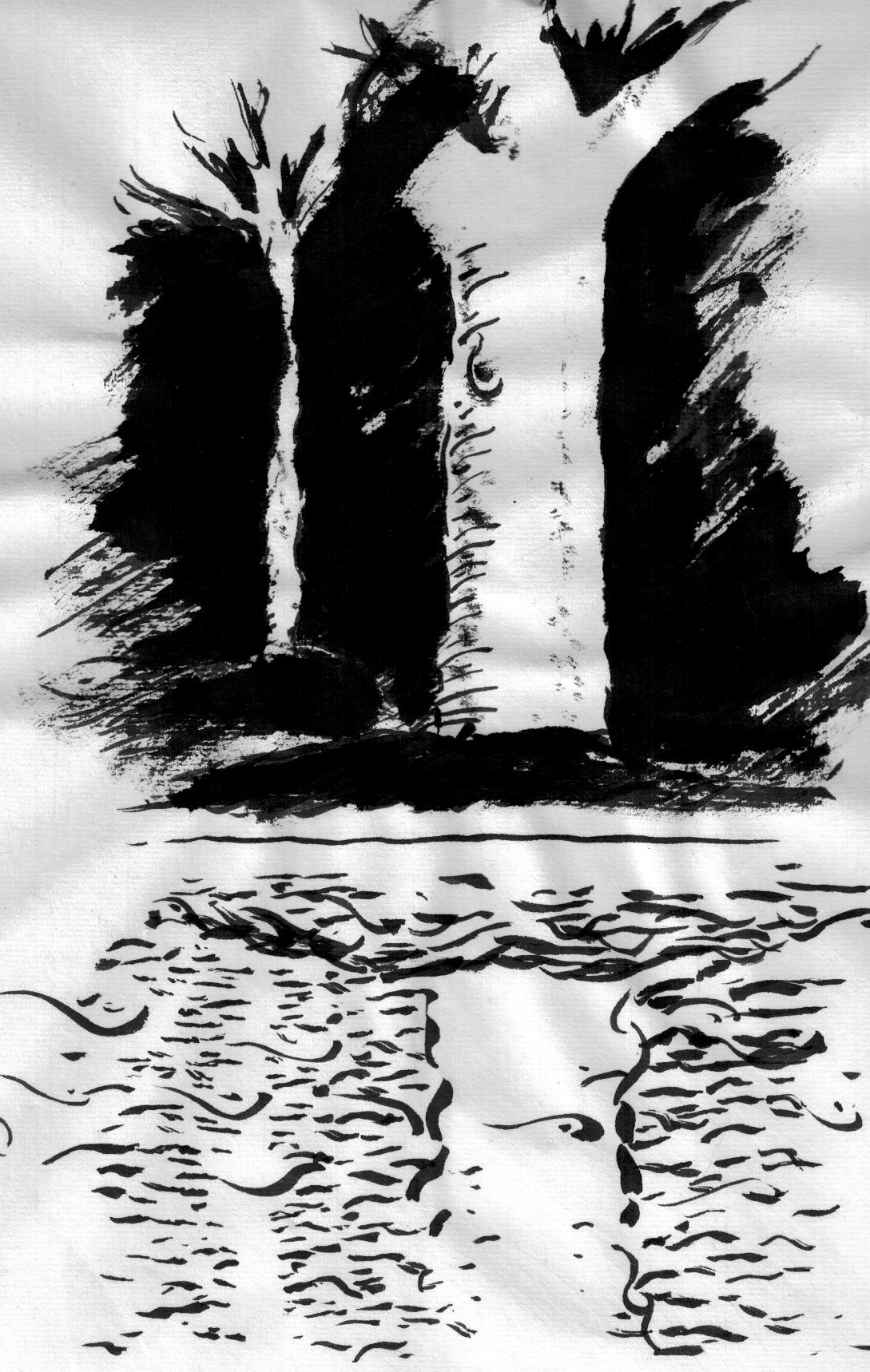
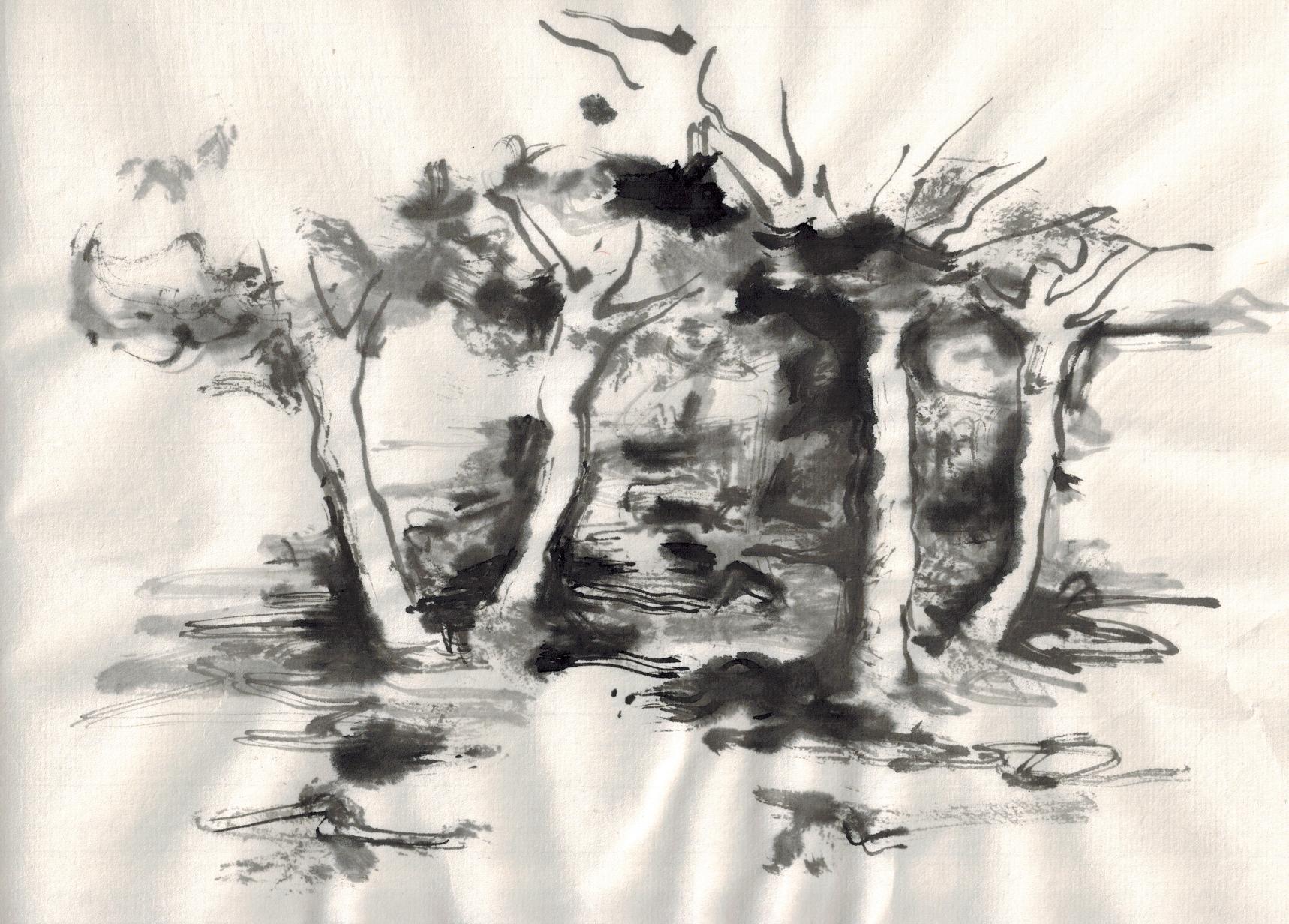
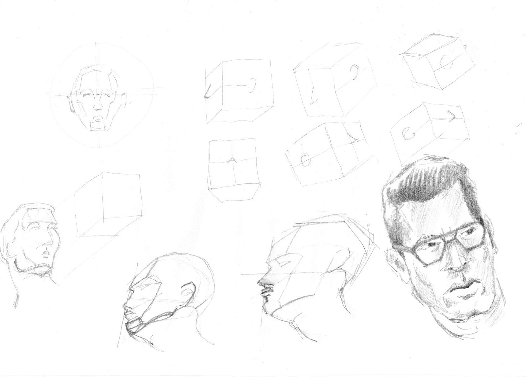
2nd pic (this was actually, what we may have been expected to be doing, as the paper is too thin, I couldn’t use any washes, or at least I didn’t dare use any):

20150512-2

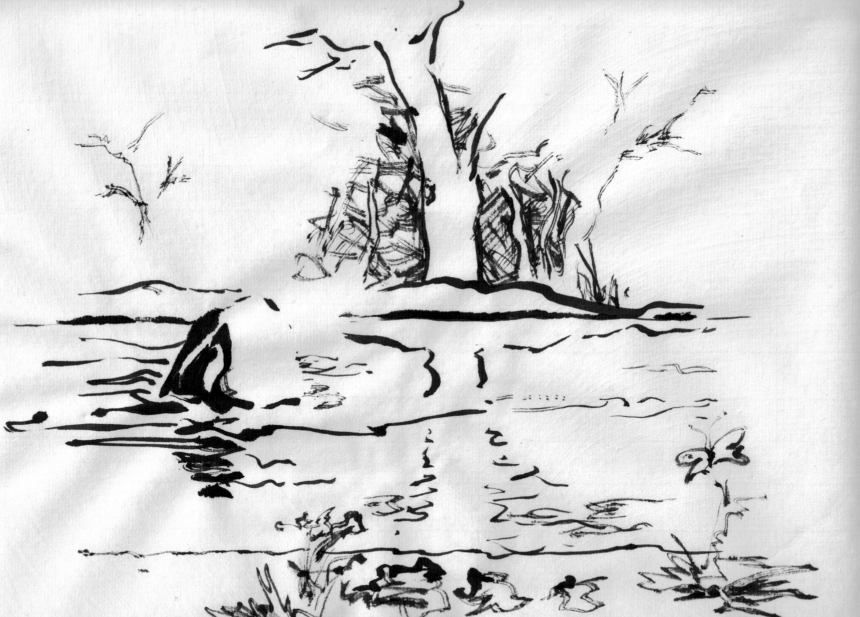
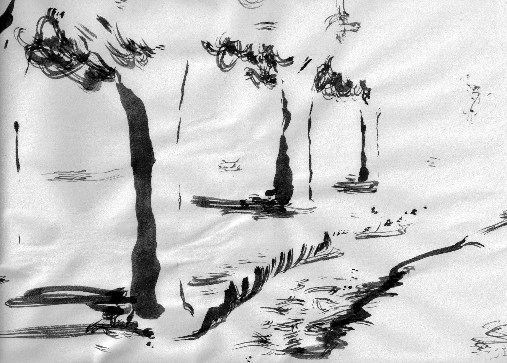
3rd pic (Then back to the river bank scene with a stone and a butterfly now) (got some good advice here too):

20150512-3

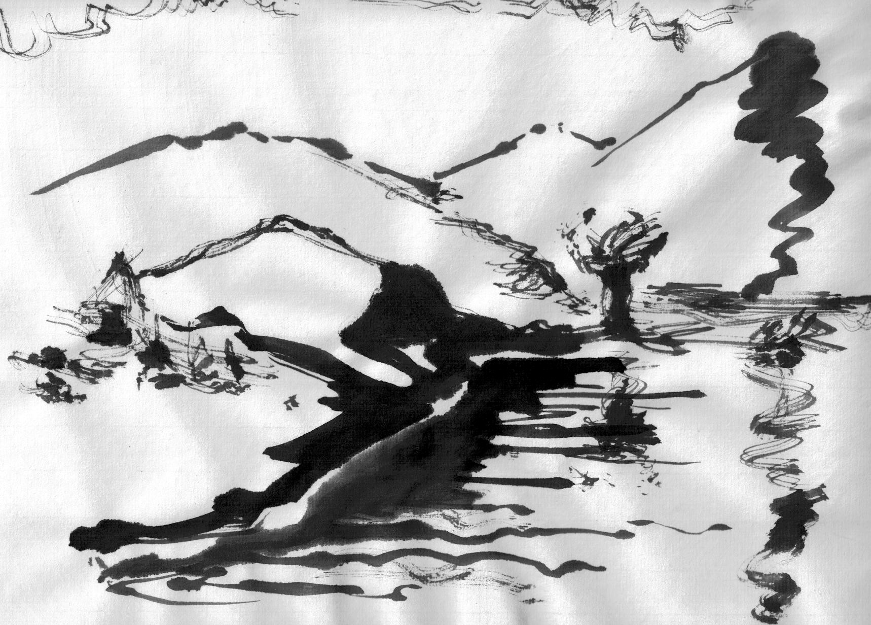
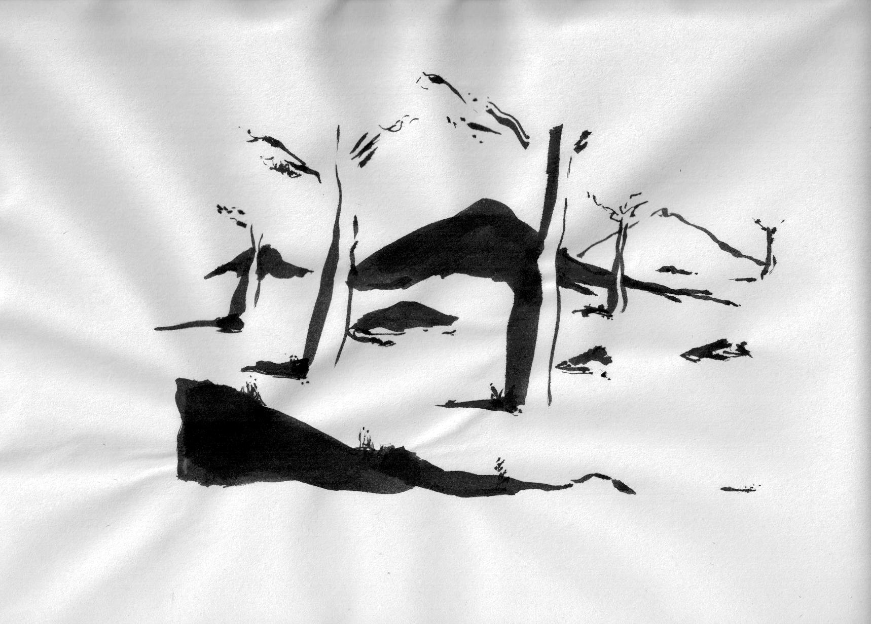
4th (back to the waterscape, just a 2 minute sketch):

20150512-4

5th (trying something out you see all the time):

20150512-5

And the last one, 6th, basically had an idea, but I also needed to use up my ink:

20150512-6

Contrast … and Trees

Just back from my Tuesday inking course. Today, we were to learn how the darkness of a surrounding area, when contrasting with lighter elements, can bring the lighter objects (here trees) towards the viewer.

The first few drawings (chinese paint brush, India ink in differing states of dilution, on extremely thin calligraphy paper) are exemplary for this, but the others were drawn by me in the last 30 minutes, obviously just because I was having fun or I just needed to use up my ink. (The first drawing has a bit of Van Gogh and Bill Watterson.)

20150505-120150505-220150505-320150505-4 20150505-5

There Be Faces

Tricking myself into drawing anytime, by using the cheapest materials I can get my hands on. Obviously trying to convince myself that the sketch is just a sketch and can be thrown away. No pressure. No need to be perfect, don’t even attempt it. Just draw.

So here goes for faces on used envelopes.

20150326-220150326-1  20150326-3

Bridgman … and I

This is terrible, I know … returning to Bridgman again and again. And letting those awfully long breaks get in my way. Making me believe I’ll never get the hang of perspective, mass and form, not to mention gesture and fluidness.

Anyhow, this morning I had the courage to sit down for 30 minutes again and analyse the ad I have had open on my desk for the last 5 months (full of faces reminiscent of Italians). My analysis concentrates on what I believe could be the perspective of the head when viewed as a box. Everything that follows from there is based on what I still believe to know thanks to George Bridgman. I’m still missing or have forgotten or have never really understood lots of what he’s tried to teach me (or at least what I’ve tried to learn from his book(s)).

But if I can teach myself this perspective mystery with diligent work, I’m sure once I begin approaching the next Bridgman lessons they will promise a much greater success in my learning process.

Here’s what I got out of those 30 minutes.

20150307_faces_01

Back to Business

Returning to the pencil after over a month of nothing.
I left my path after spending a few days with George Bridgman’s “Drawing from Life”, which more or less gives you tools and expert insight, but basically expects you to experiment with the provided options. It is a great eye opener and what probably pushed me off my high pedistal was the obvious ease with which Mr Bridgman finds his planes, light sources, masses, forms and perspective, rendering these with the seamingly simplest of lines.

Scanned Document-6

My last drawing before the afore mentioned self-inflicted break is the above portrait on the left, the portrait on the right is from today. The was basicall no drawing during th ebreak. Both are about 5 minutes work. The last month I had been realising once more how important the perspecitve question is and also the story each line carries for the observer. If a line has the slightest curl to it, then it will influence the observer. I need to learn to understand and predict these subconcious and pre-programmed reactions of the audience.

Also, before leaving the drawing board for the prolonged break, I made a few attempts at tracing the Classical Masters. I’m not sure if I am infringing on any copyright licenses here. This is a trace of a Carracci and a Michelangelo. These are probably excellent exercises (but expensive, due to the cost of tracing paper nowadays). Here you can learn the different “stories” lines can have. It is also an eye opener which allows me to see the real value of these old sketches, cementing there classification as Masterpieces, at least for me.

Scanned Document-1 Scanned Document-1b

To put everything back into perspective, here the G.Bridgman sketching attempts I made before the break:

Scanned Document-2 Scanned Document-3 Scanned Document-4

More lines …

Continued working on my lines.
I’m flabbergasted to see what importance the smallest of lines can have. Allowing the brain to understand the precedence of plains or mass in sketches. Having fun with my Copic Multiliner and Copic Ciao markers.

20141213-220141213-1a 20141213-1