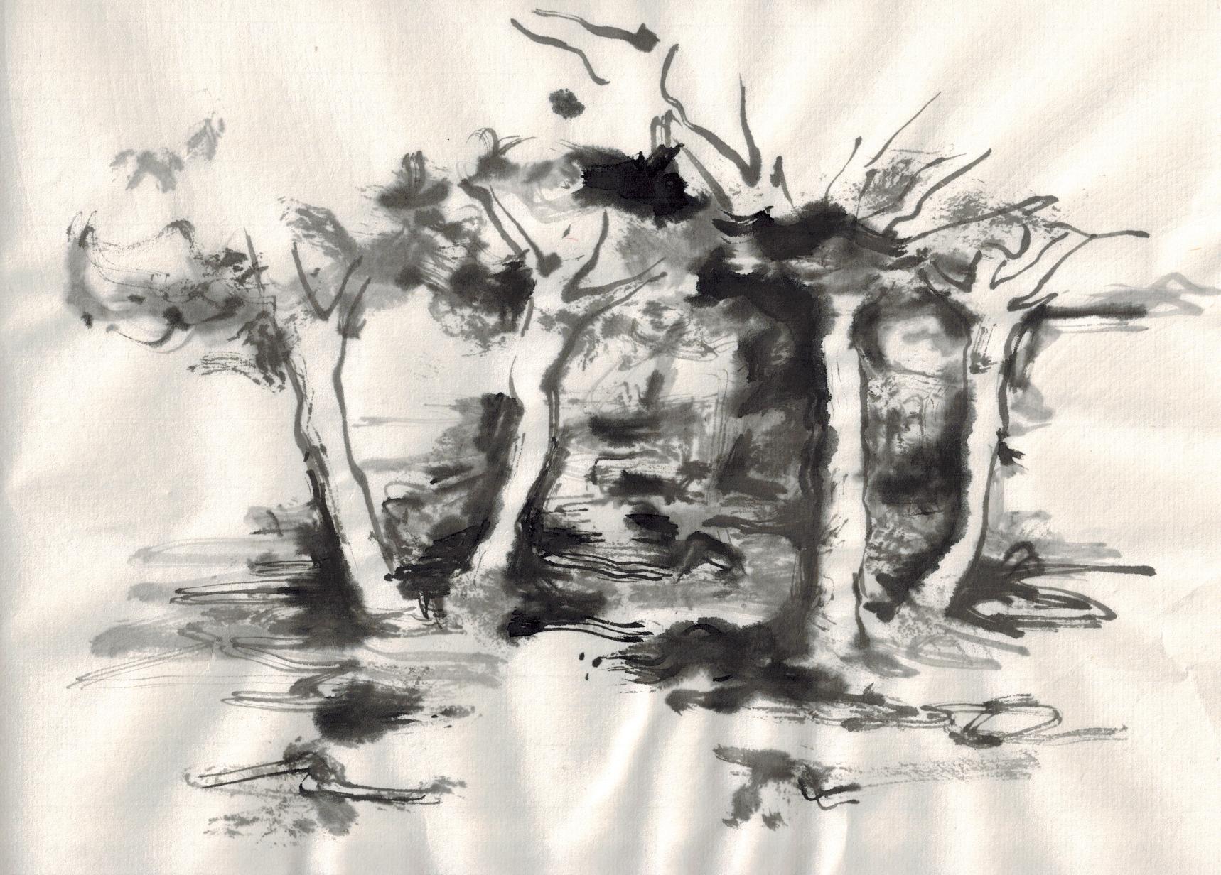
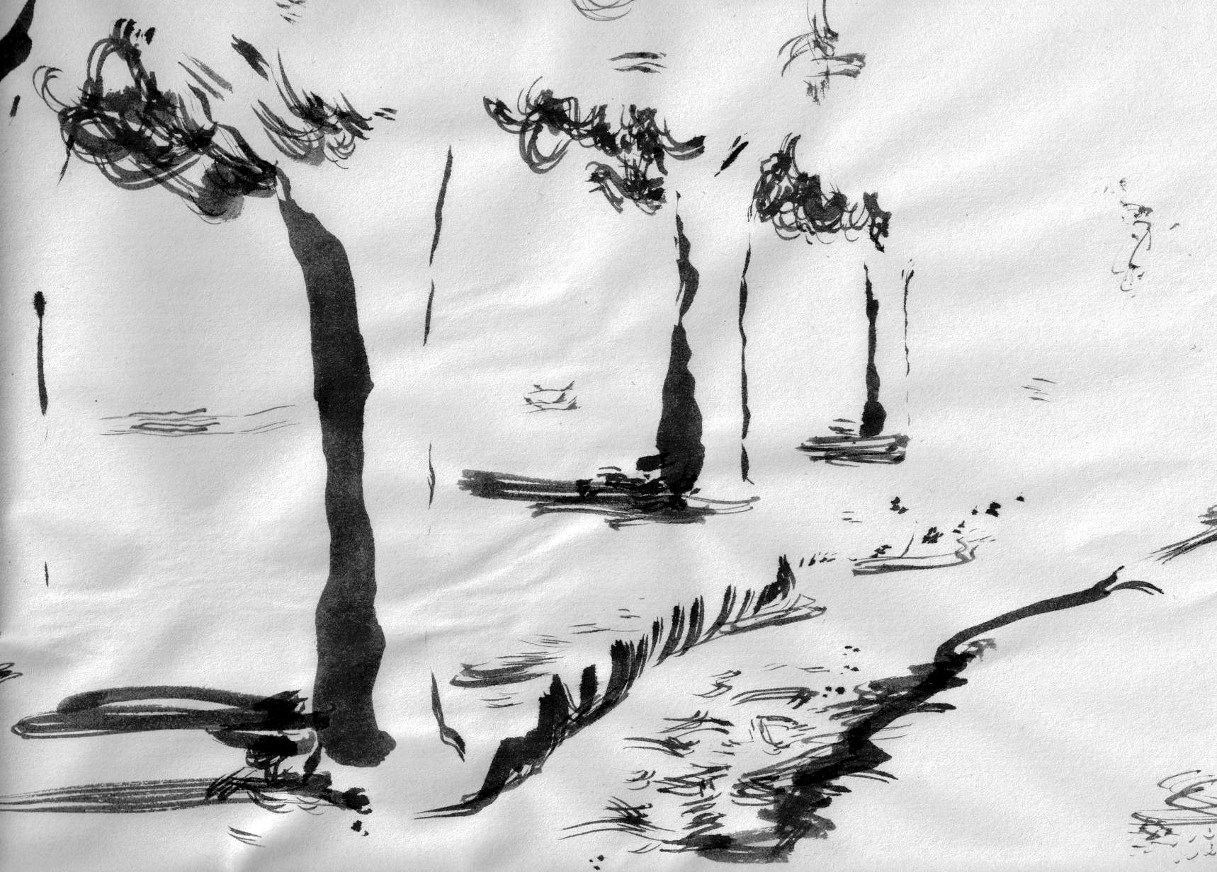
Just back from my Tuesday inking course. Today, we were to learn how the darkness of a surrounding area, when contrasting with lighter elements, can bring the lighter objects (here trees) towards the viewer.
The first few drawings (chinese paint brush, India ink in differing states of dilution, on extremely thin calligraphy paper) are exemplary for this, but the others were drawn by me in the last 30 minutes, obviously just because I was having fun or I just needed to use up my ink. (The first drawing has a bit of Van Gogh and Bill Watterson.)


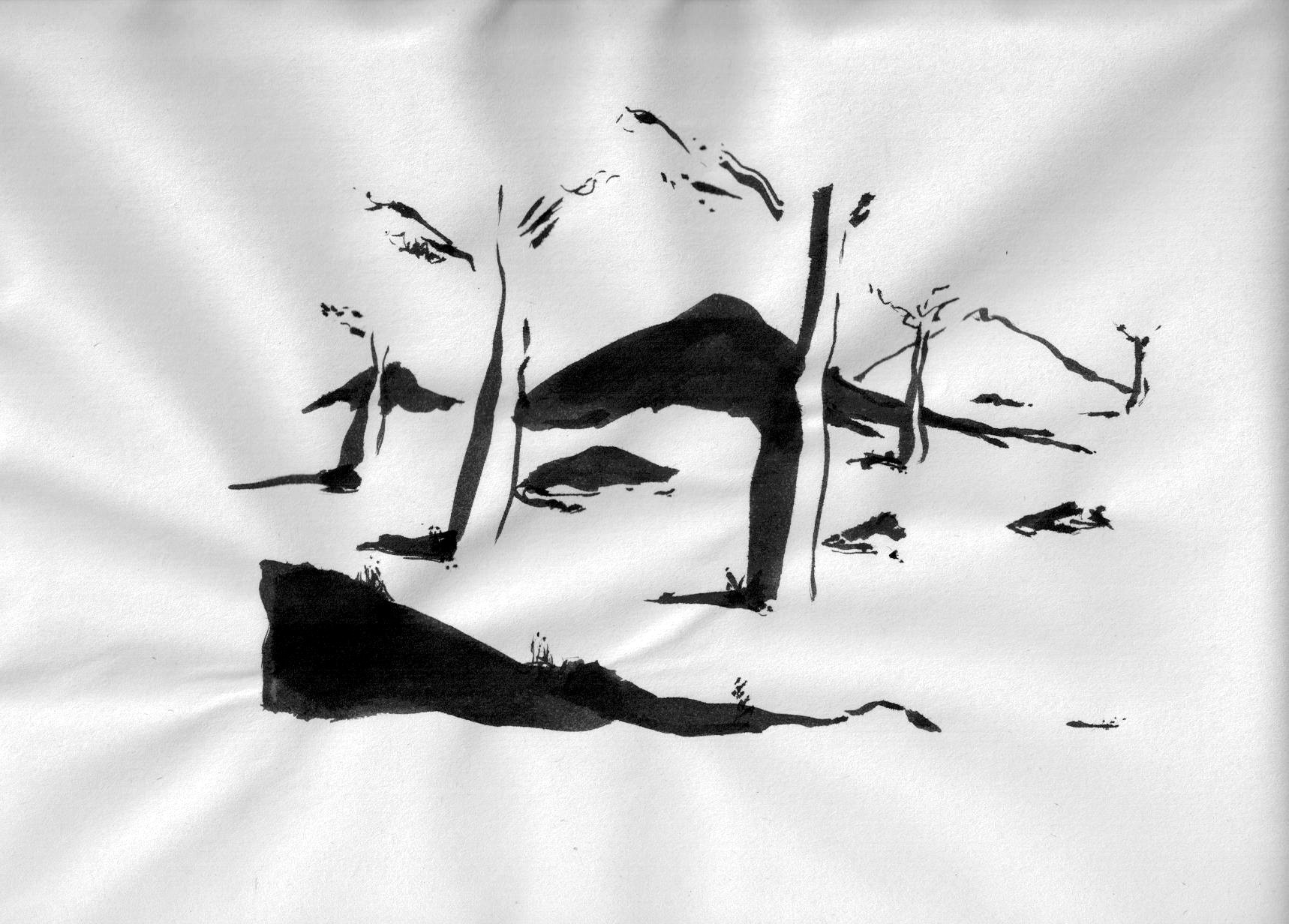

I like the bold black and white composition of 20150505-3.jpg.
LikeLike
Hi Bettina, I’m attracted to this strong contrast too. There is much to express once I know what I’m doing.
LikeLike