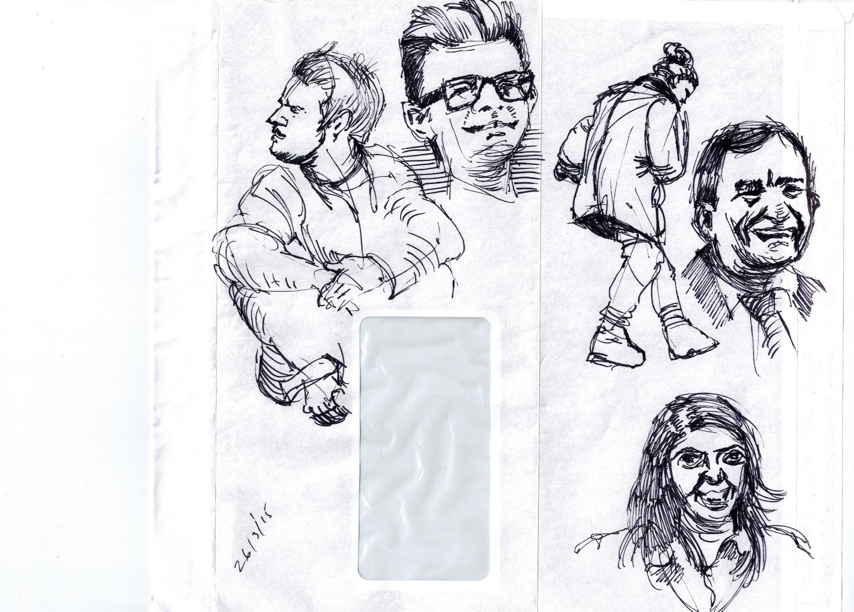
A weekend of traveling sketches and a Tuesday with ink!
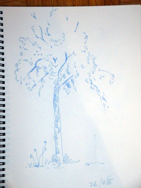
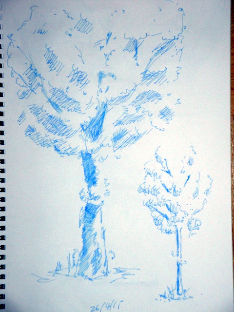
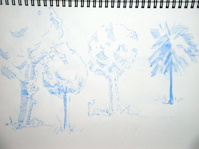
The weekend was concentrated around 1, 2 and 3 point (can you believe it?) perspective. A “few” sketches of trees and that’s about it. The summer may offer more input, as I’ve asked to be notified when a group of sketchers gets out and about, drawing scenes around the town I live in.
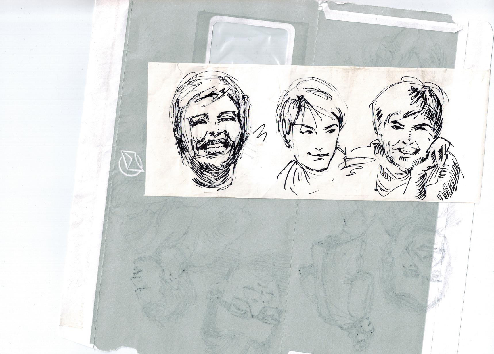
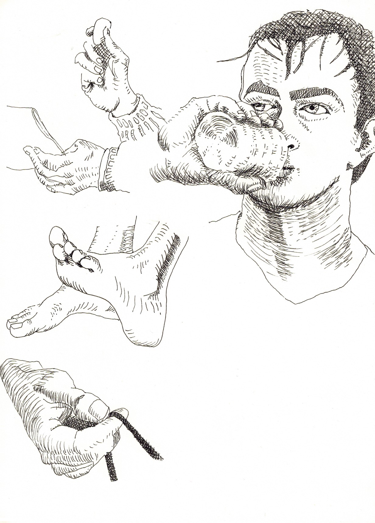
The Tuesday (today) leads me into my weekly course of indulgence into ink again. The next Tuesdays will continue similar to this.
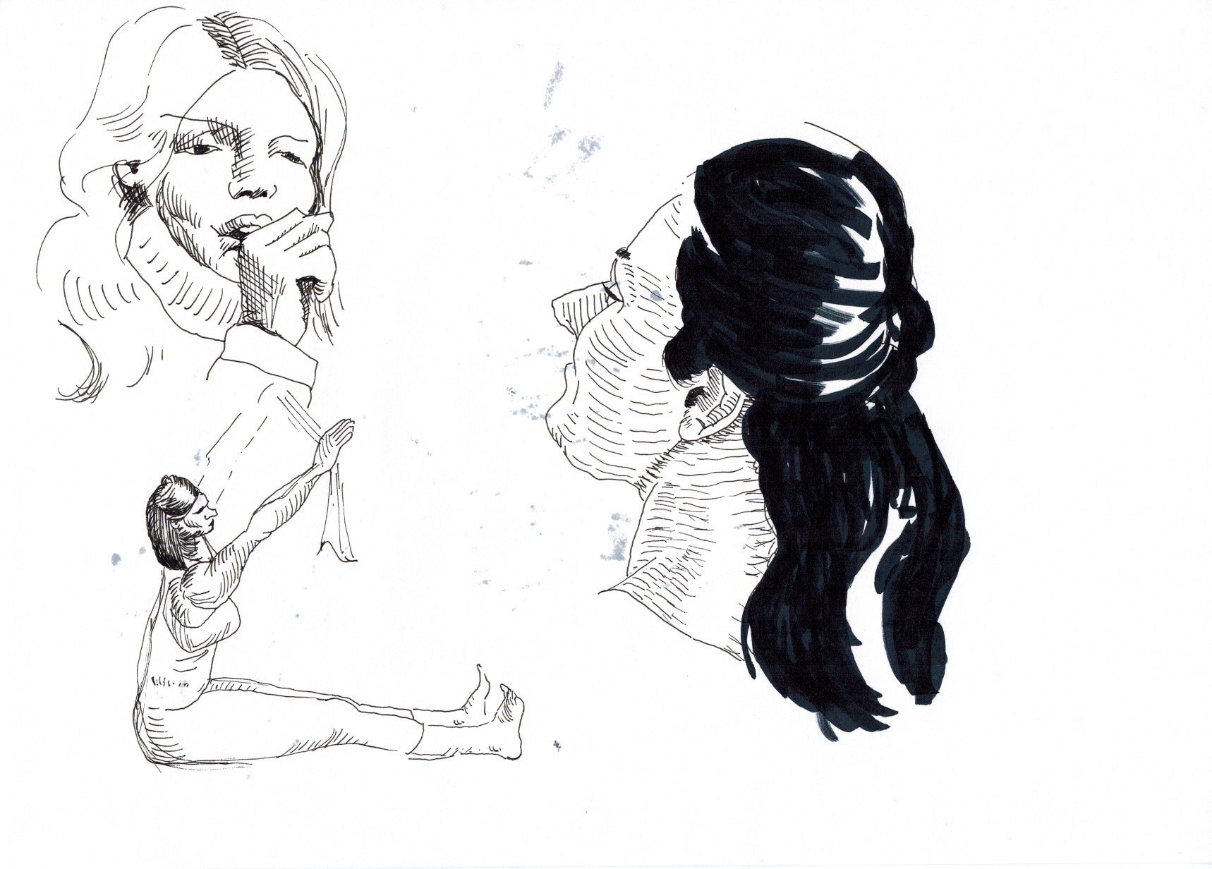
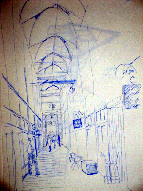
Paris, high ceilinged gallery/arcade, about 45 minutes, then a few in 5 minutes, with water and paintprush, after using fountain pen to draw these:
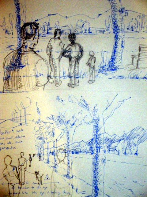
Trees and a bit of street scenery:

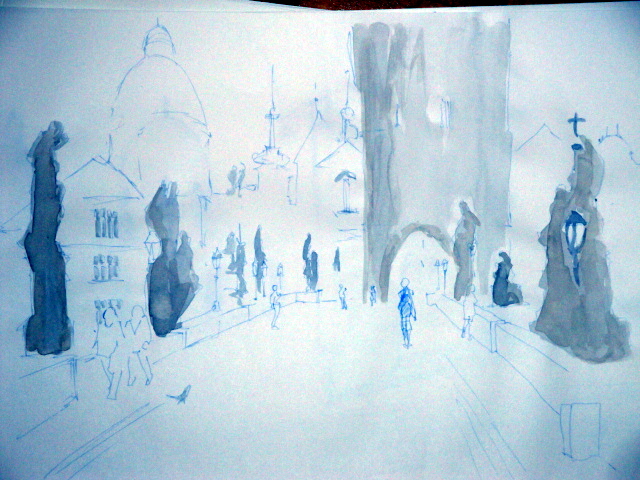
Prague:
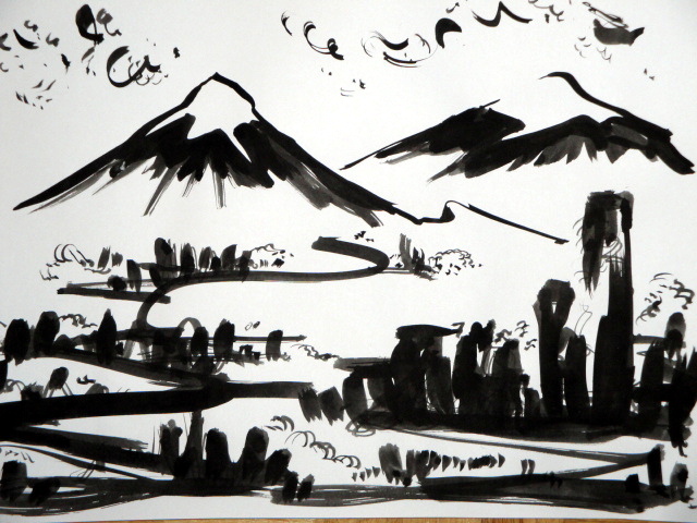
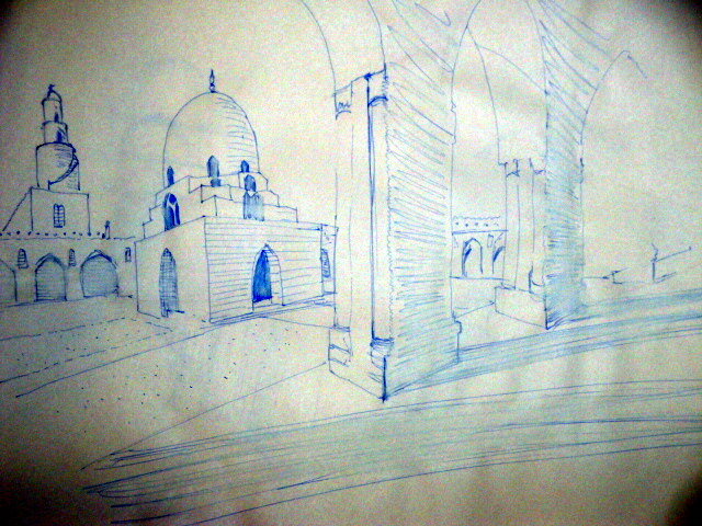
Cairo:
Country side here in Germany:

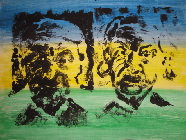
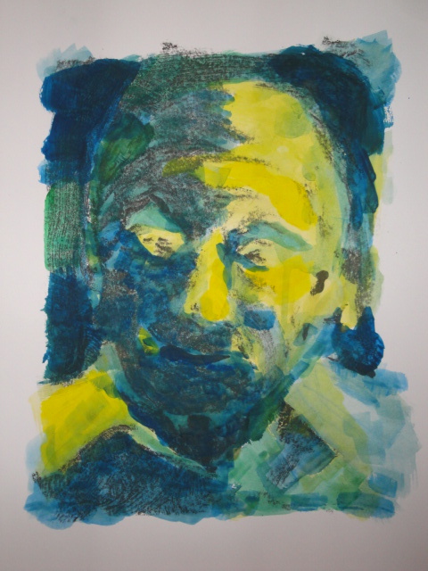
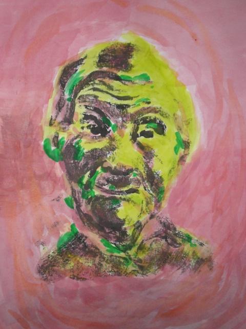
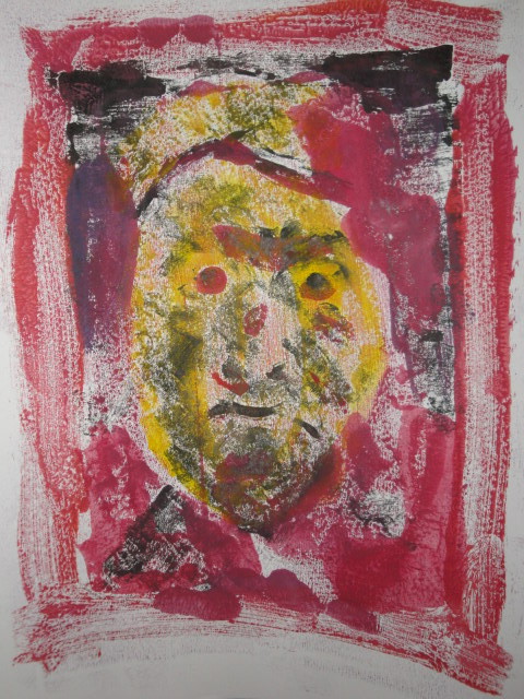
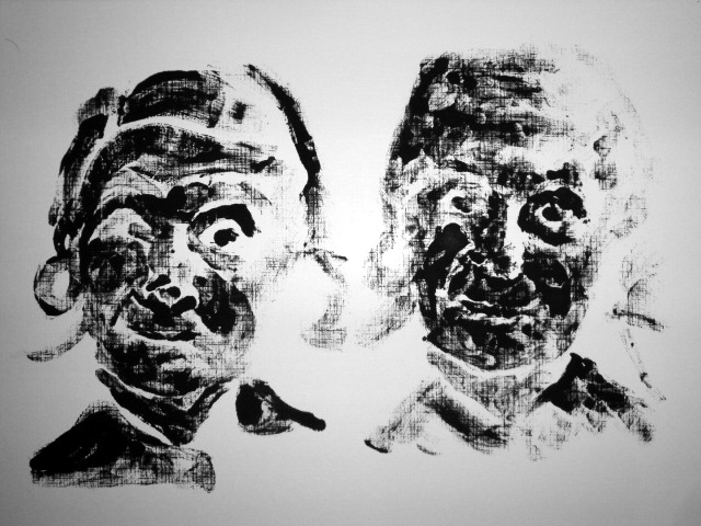
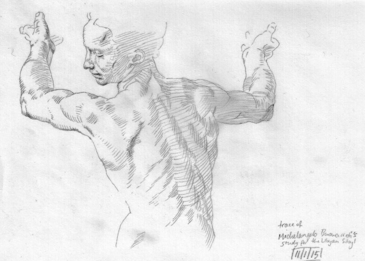
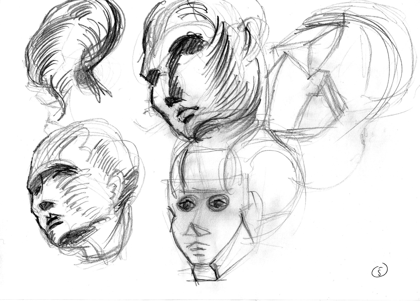
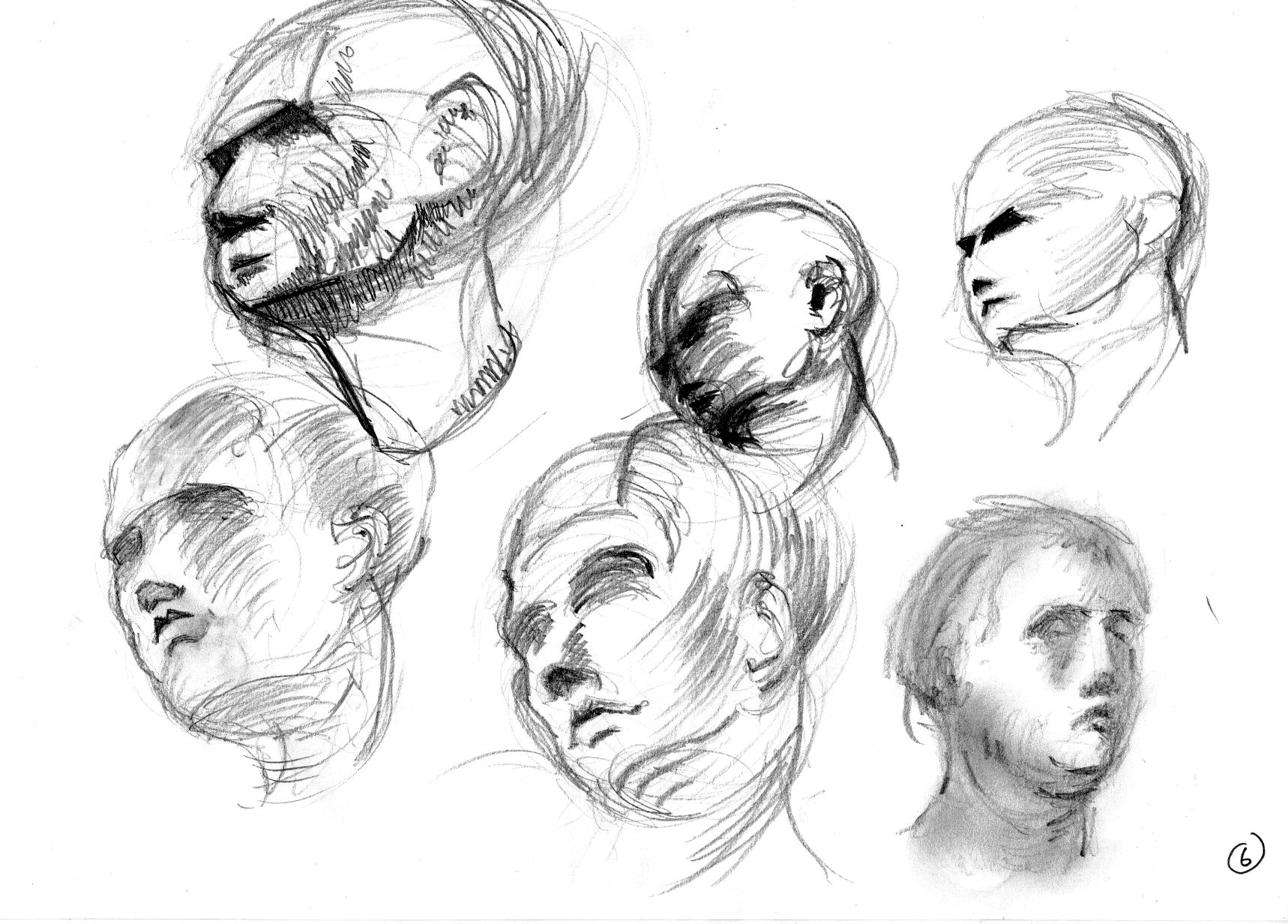
Copies of some Masters, don’t ask me which:


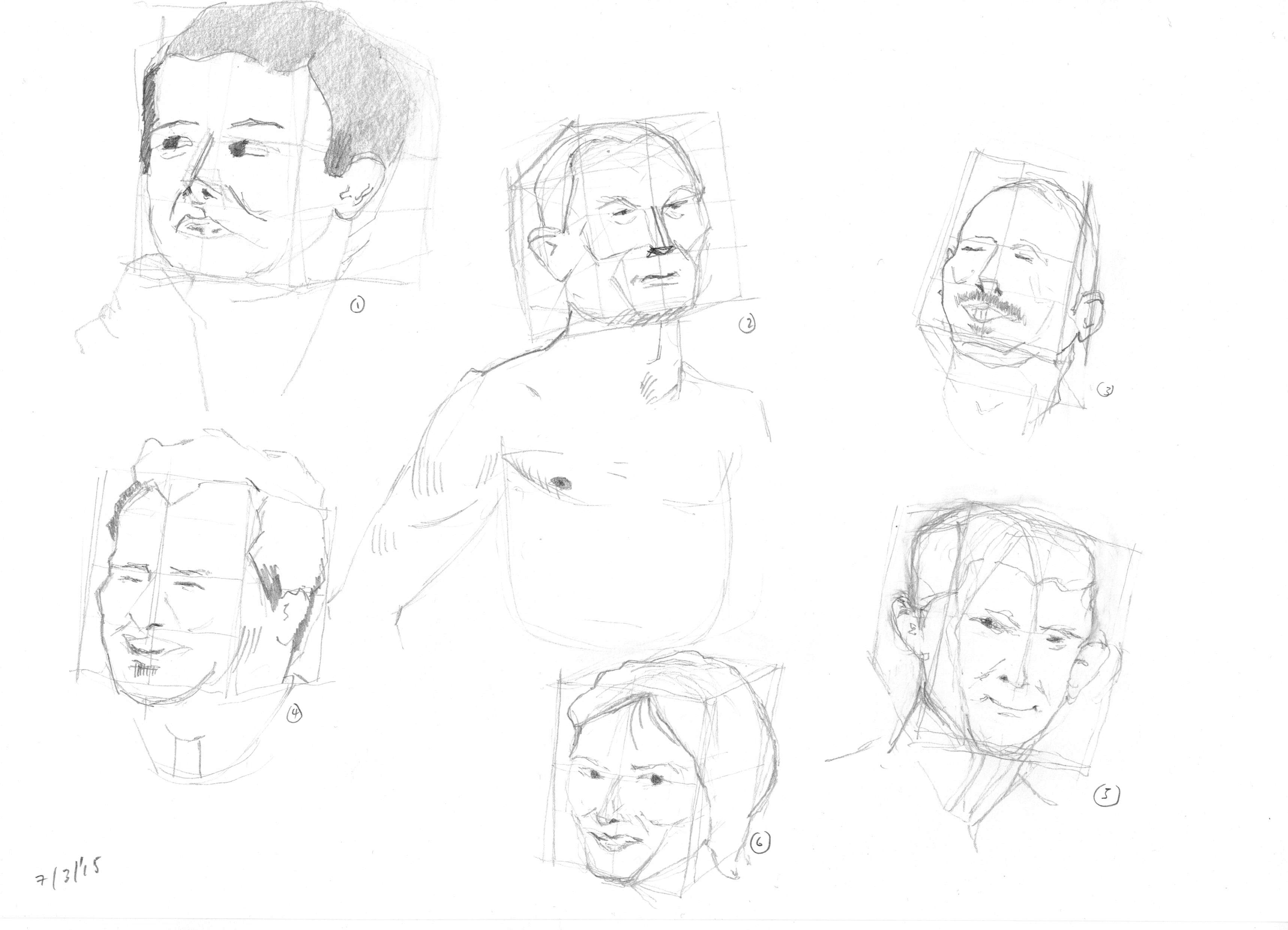
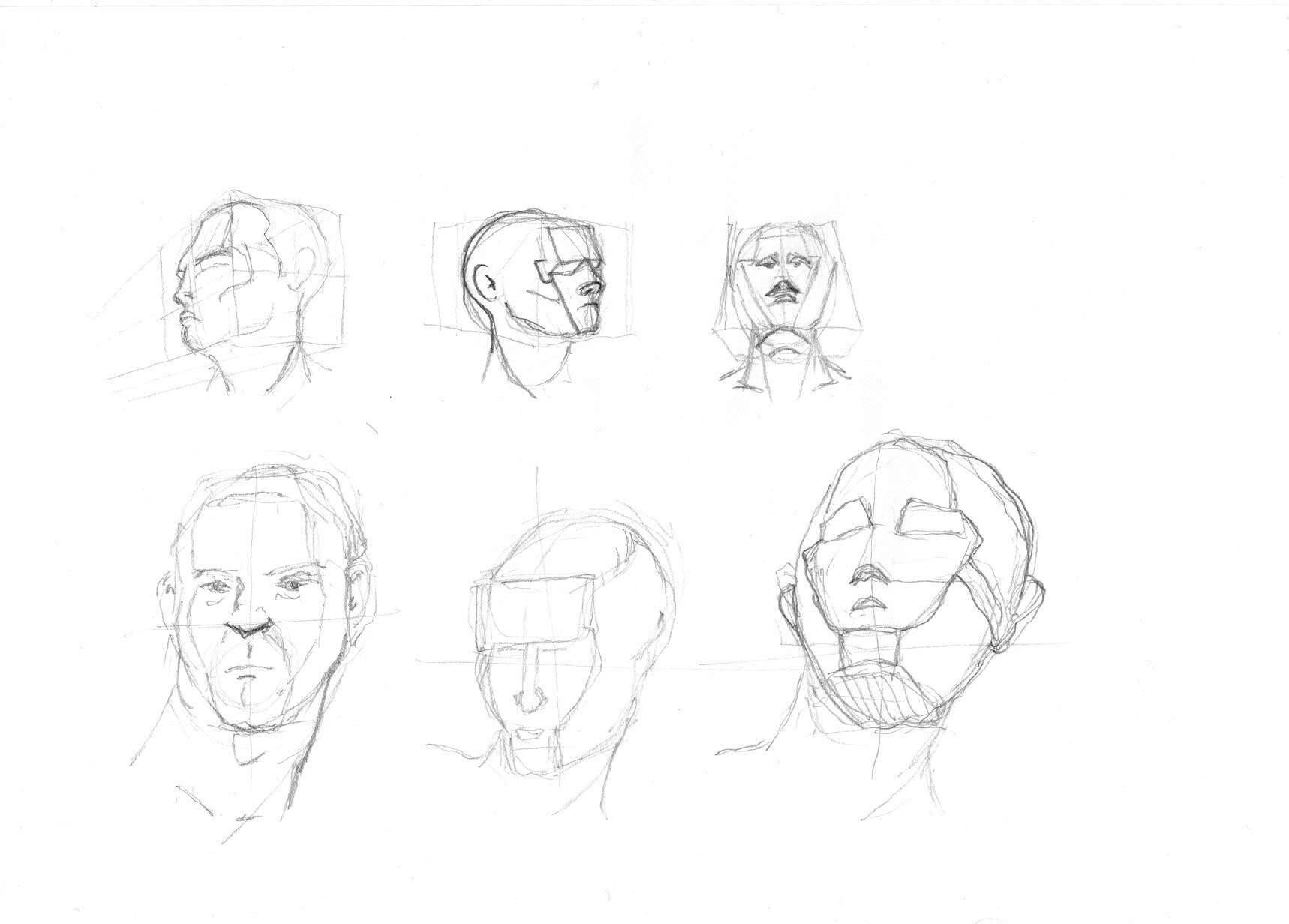
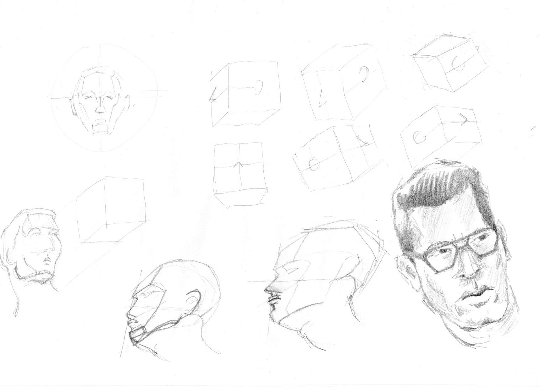
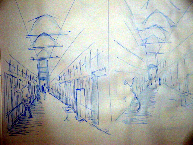
Some practicing of perspective:
 ho
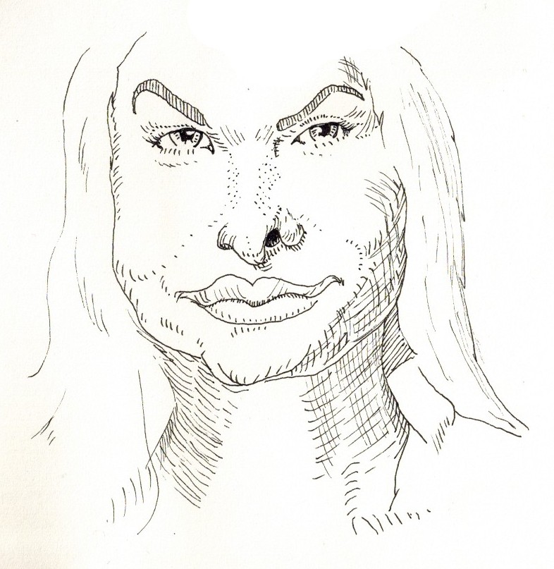
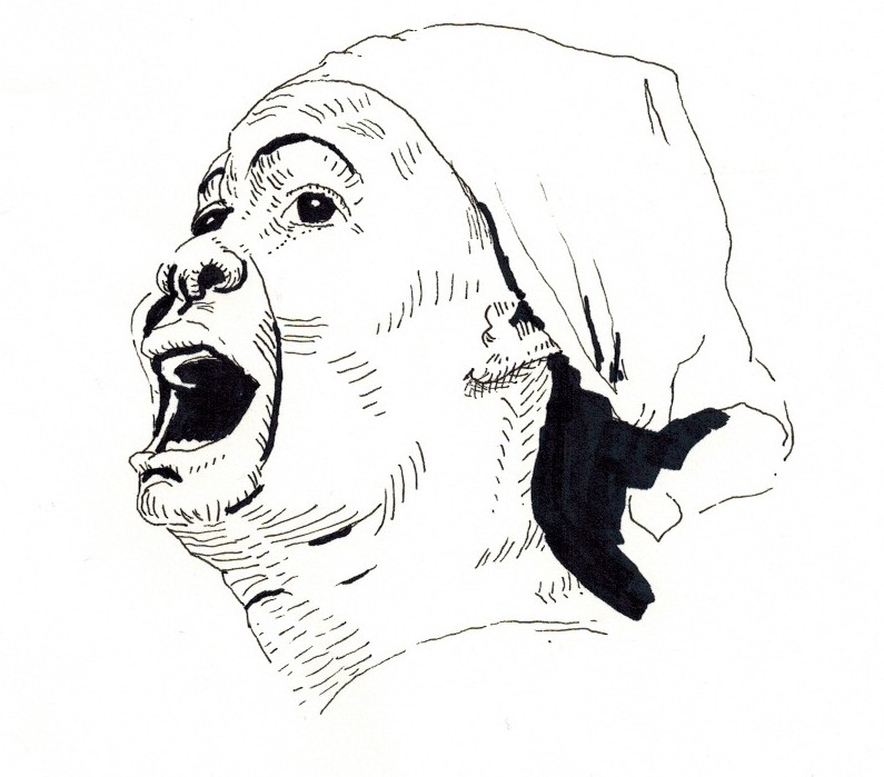
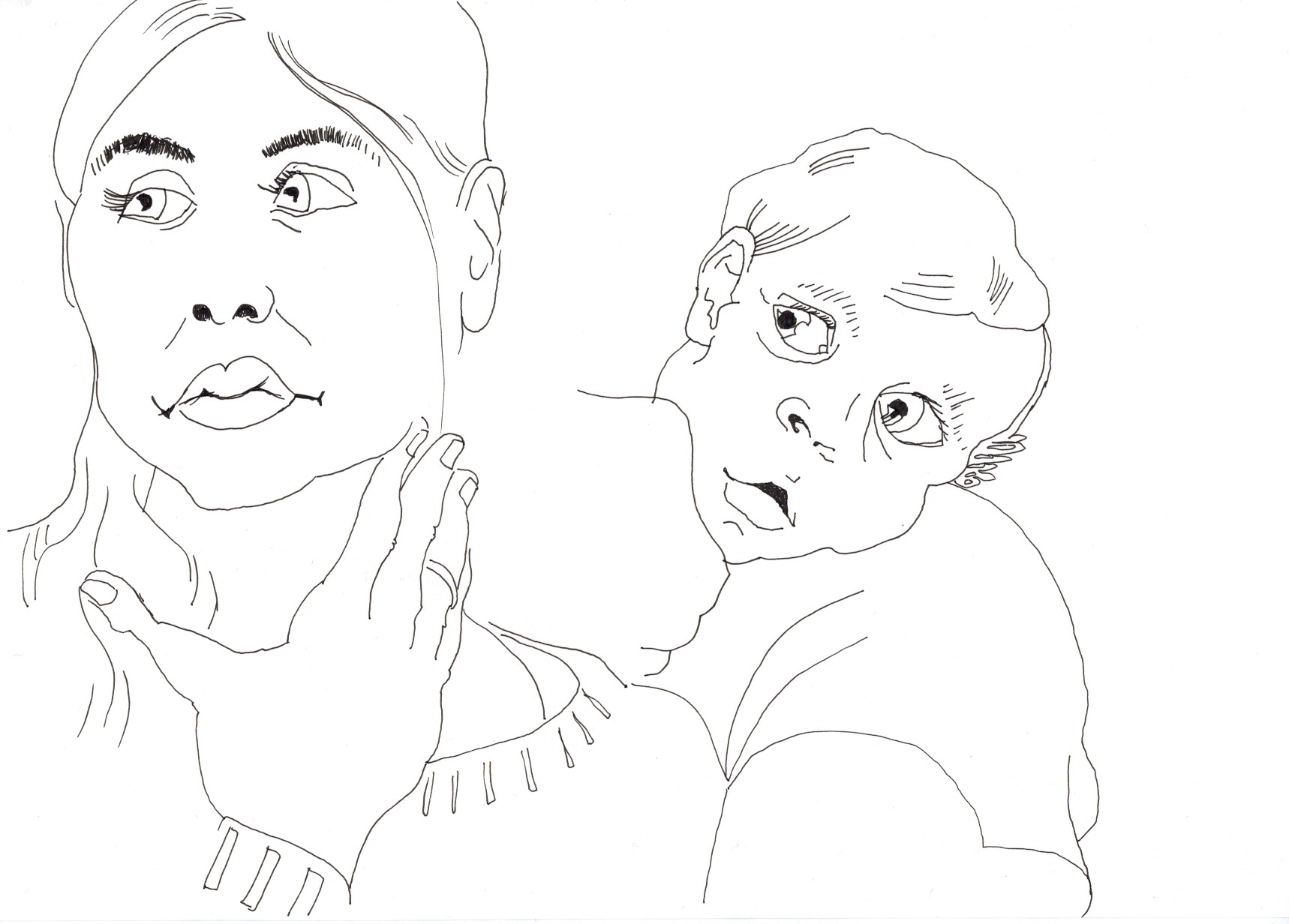
hoNow comes the Tuesday with ink.
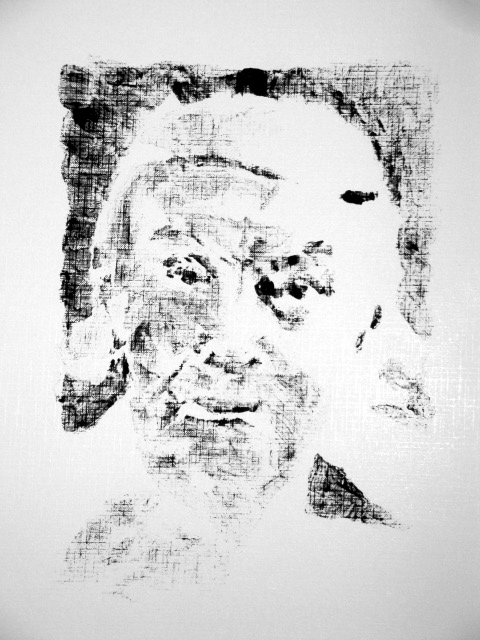
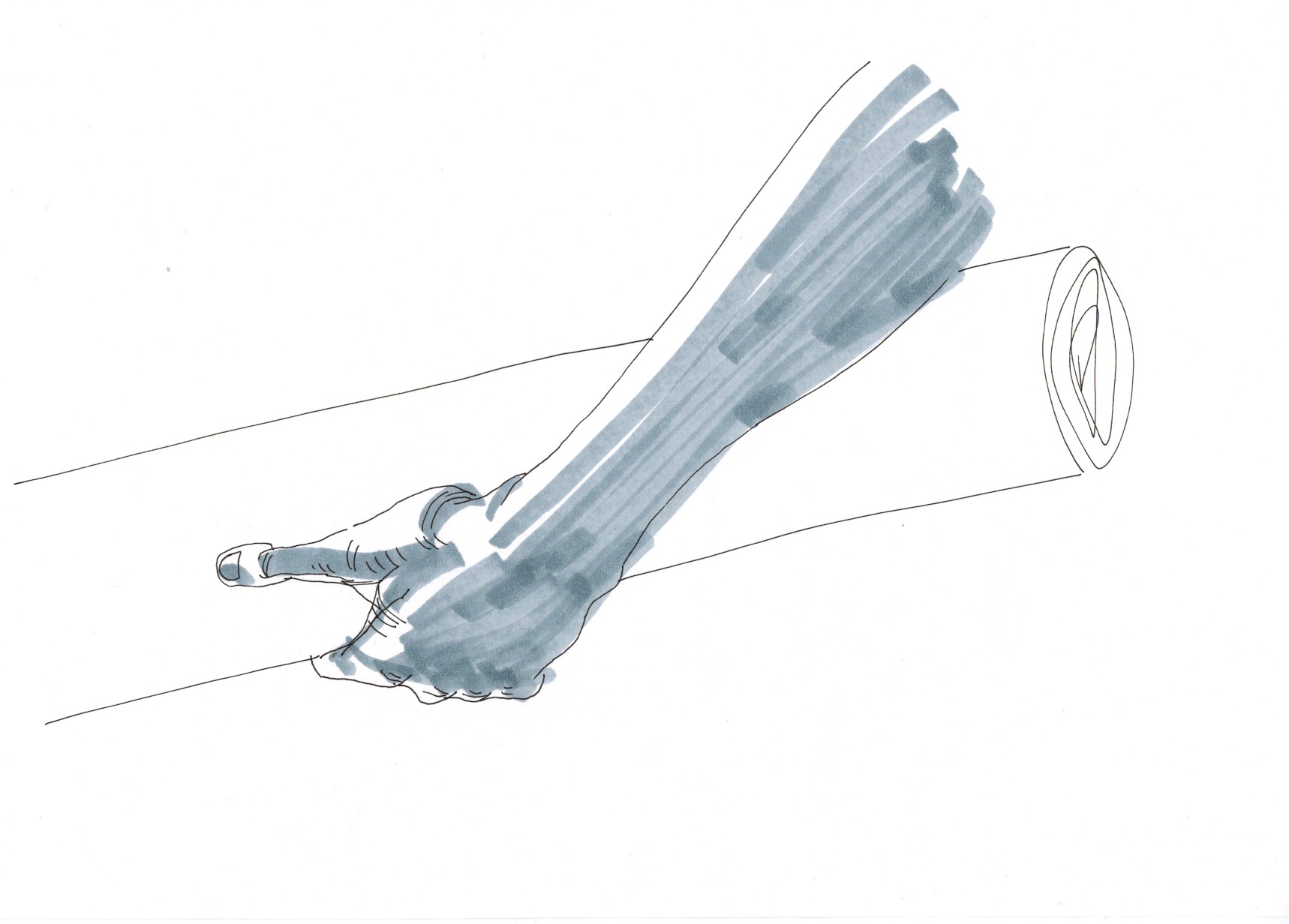
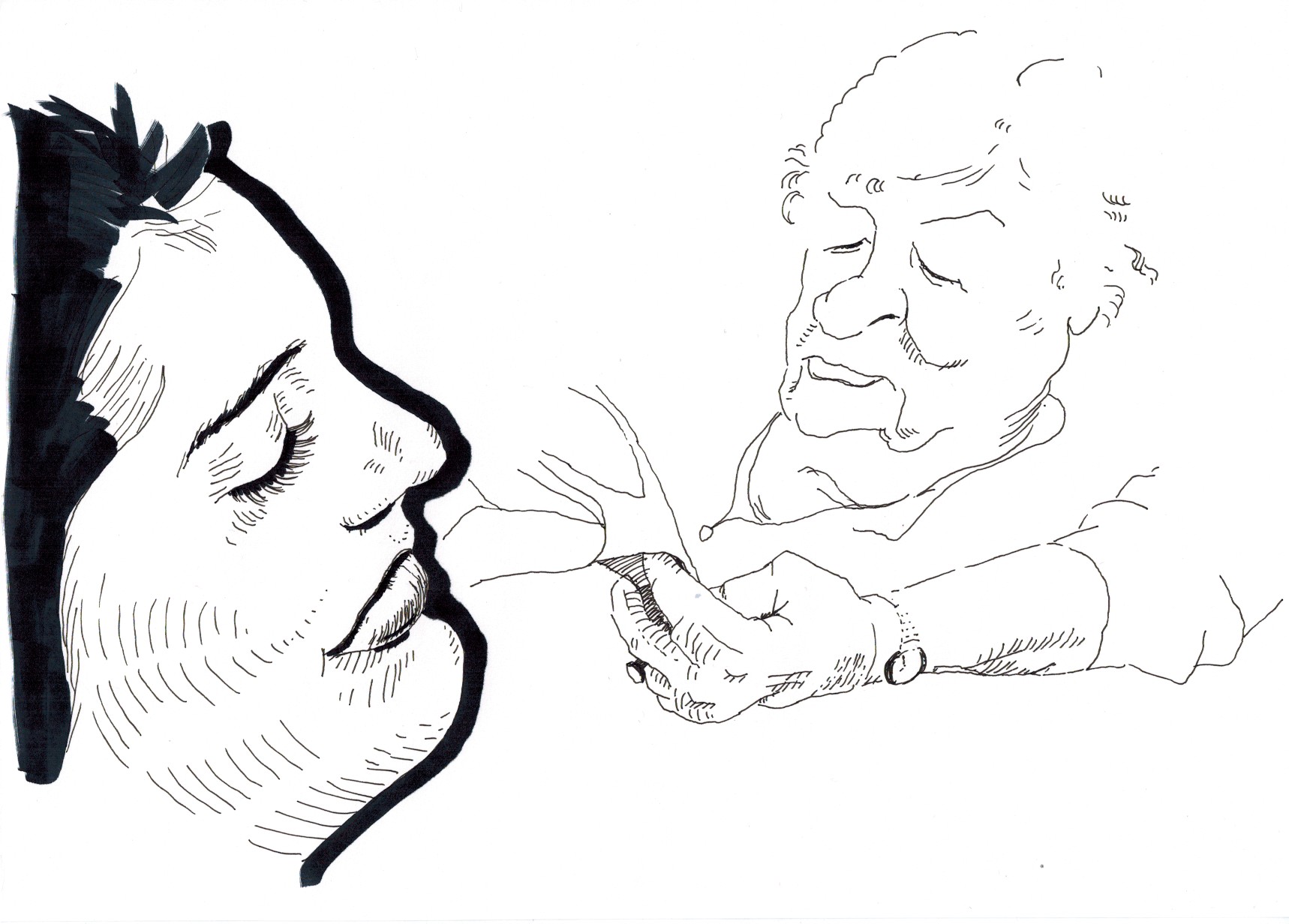
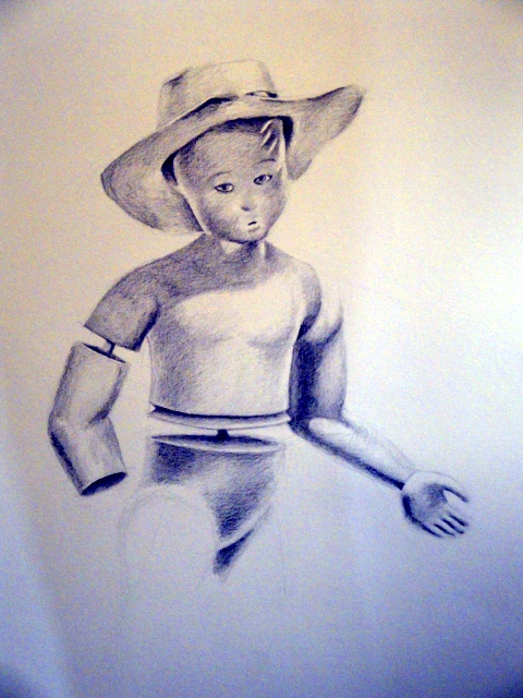
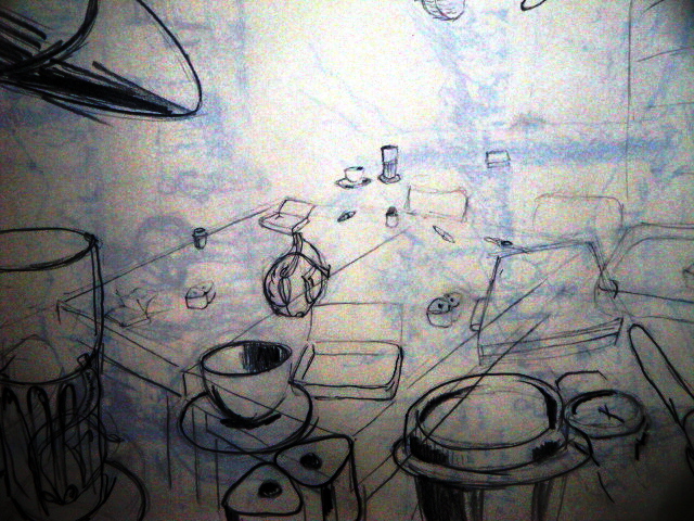
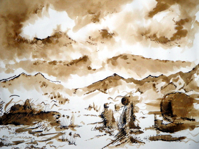
Sepia, 1 hour:
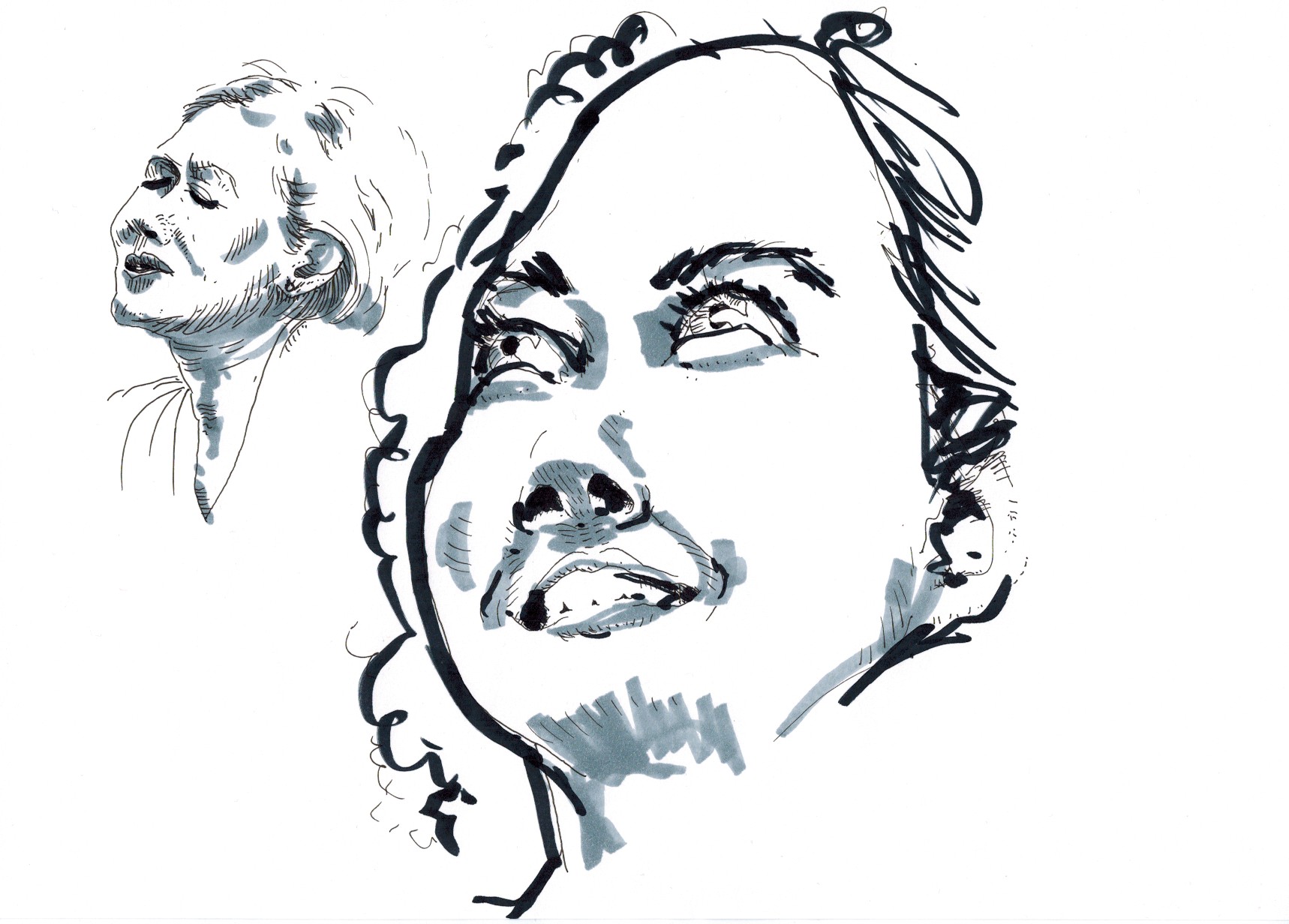
And black Indian Ink, 5 minutes: