A bit of Drawing

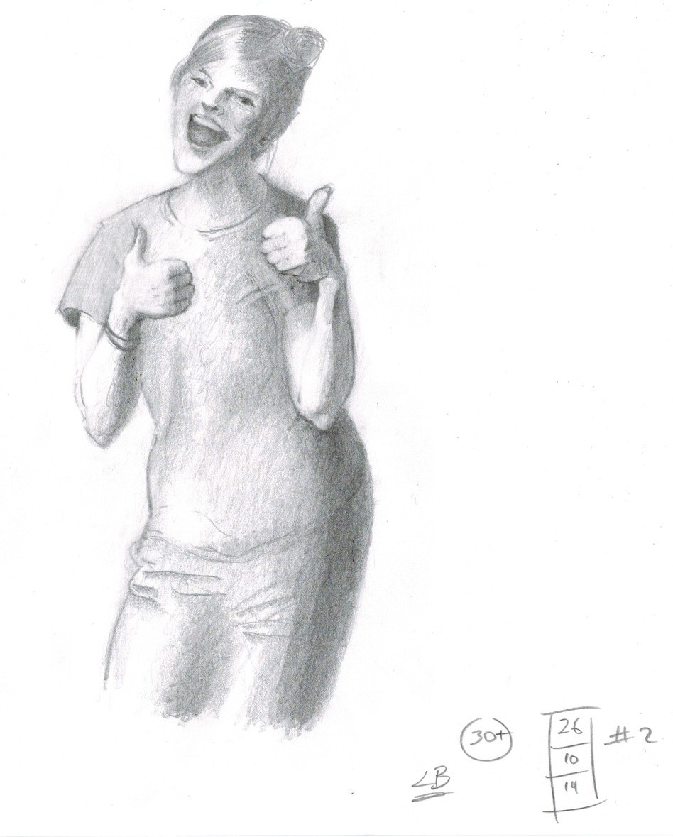
After attempting a weekend of gesture drawing in various styles and chasing different goals (especially trying to break out of my scribbling style for a short while), I spent the morning’s first hours working on a gesture of a rock musician sitting on a field which ended in an outline sketch:
20141026_01

On the weekend, I started re-reading Michael Mattesi’s “Force. Dynamic Life Drawing for Animators” and was now looking for the applied forces and direction of any future movement of the “model”. Anyhow, once I was satisfied with the above (despite the strange knee), I continued with the next gesture and then I decided to fill it with tone values.

I know the anatomy on this one is also not correct, anyhow … while drawing this, I started thinking in planes, as George Bridgman mentions a lot in “Drawing from Life” and had some wonderful insights.

I’m not sure I would have noticed the points without studying the theory; it was incredible to see how the consistent shading of planes with same or similar orientation in space helped the eye and brain to place the individual parts of the model “correctly”. I decided on a few real highlights and noticed that erasing any lines I had previously made close to them enhanced the strength and believabilty of the entire drawing (I did A LOT of erasing, which is very unusual for me).

So, no lines near highlights. Consistent shading of similarly oriented planes. And, less contrast in the background.

20141026_02When I got back from work, in the evening, eyes drooping, I decided on shading the first drawing:

20141026_03I’ve been using 2B here on cheap (80 gr) paper (A4). On the last sketch I chose a 4B to make a few darker lines here and there. Well, there are good and bad points, but it’s fun to do more than gestures!

Describing Mass (Mass over Shading)

There are a couple of points here.

Ok, this isn’t a great picture. But it is only about 15 minutes and what I am concentrating on here is to learn

  1. why I hear/read so often that drawing from magazines/photos is harder than from real life
  2. how to draw mass
  3. what lighting can do to mass
  4. how to draw lines instead of always only building up tonal values by shading
  5. how to keep my mind/eye off cast shadows

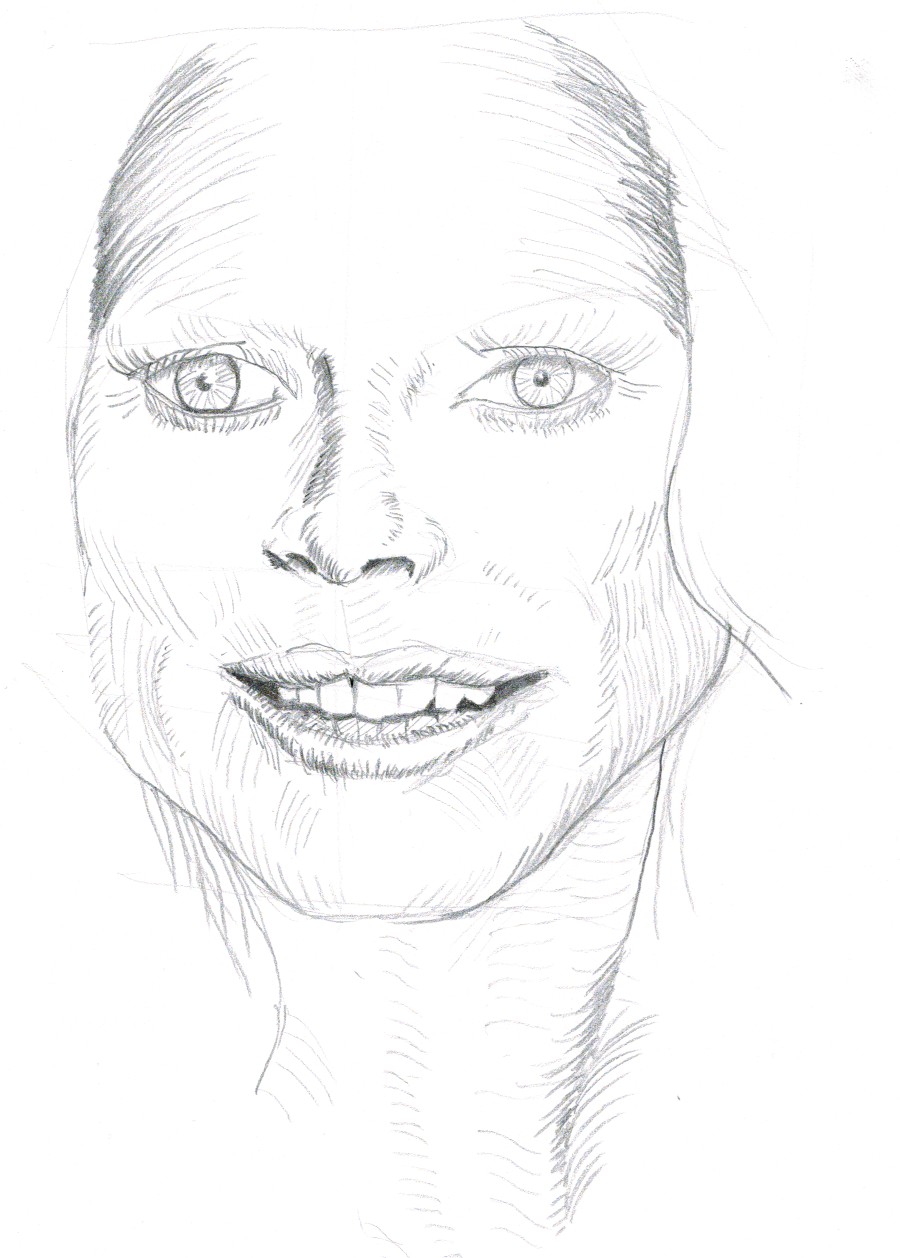
20141012_01_Heidi

First off: yes, drawing from photos is now a lot harder, perhaps nigh impossible currently. I used to just copy “tone value” by “tone value” and get a nice copy of the picture in the magazine. (Could have photocopied/xeroxed it).

Now, I’m looking for mass, trying to display the forms and variations in the mass with contour lines, or any lines, but not by building up or copying shadows with tonal values.

But photos of models like Heidi here are lighted brilliantly (glaringly) from the front. So the face looks pretty (slip of the tongue there) flat.

By the way the contour lines I made on the sausage (above the eye) and the lower eye lids are not the eye lashes. The lashes and the eye brows have no mass, so they’re not in my drawing. See also Leonardo Da Vinci. You won’t see many eye lashes or brows in pictures from the Renaissance. As did  Leonardo, I also added a bit of cast shadow to the iris leaving an “impression” of eyelashes.

Lines: attempting to not correct my bad lines too often. The first line needs to sit well. That is the goal. Not there by miles yet. Flaring of the line, or perhaps better put: “feathering of the line”, obviously works better for me if I begin at the feathered end and draw towards the darker point. I haven’t got the control of this line yet, but it exercising this skill looks promising.

I noticed in my “finished” product, that I didn’t copy the cast shadow of the head on the neck. And that I kept the contour lines on the neck nice and decent, quiet and light (at least the ones I made towards the end of the drawing), which allows the neck to move to the background. Just where we need it.

So, not too much of a loss here. Need to practice more. Practice. Practice. Practice.

And a few hours later … here another practice session. (both drawings are using a 8B round tip pencil, not especially sharp.)
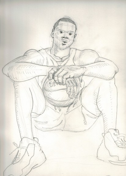
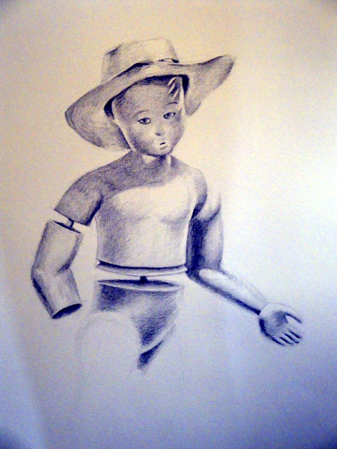
20141012_02_BB

Charcoal attempts

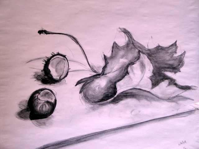
Here some of my first serious attempts at using charcoal for longer than a minute.

The following is a one hour study of texture (influenced by bad light), mass and composition. One goal was realism.
DSC03220

(Pressed charcoal pencil (soft) and vine charcoal twig on smooth newsprint.)

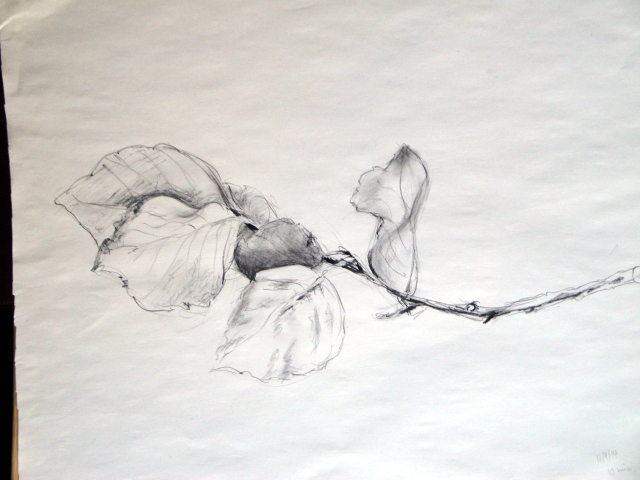
To use up some left over time, I picked a new branch and gave it 10 minutes or so.
DSC03222
(Pressed charcoal pencil (medium) on smooth newsprint.)